
Jottings
CONSOLE CONSIDERATION - Mishpacha Magazine
I love the feel of an instant-gratification home makeover. Obviously, with most aspects of design, there’s a multistep process, but I like to “put the sprinkles on the cake,” adding the finishing touches that make a room pop. My goal is to leave a space feeling warm, inviting, and interesting.
Here I’ll take the same console and style it in three diverse styles. I hope this can inspire you to elevate your space and make it your own.

The Naturalist:
Everything in this space is made of materials found in nature. The key here is to create texture via materials used. Natural elements like plants, stone, rattan, and terra cotta create a light but visually interesting space; the different shapes and contours add layers in the look.

The Zen Chaser:
This space utilizes clean lines yet veers away from feeling cold. The asymmetrical mirrors add a great dimension, while a footstool can be tucked underneath to create visual interest and extra seating. I always like to incorporate plants, and an entry is a great place to put a really special floor plant. Finish it off with some scented candles to add a sense of serenity.

The Modern Eclectic:
This ottoman’s shape and texture ground the console on bottom, while the slightly irregular mirror frames the top. Nothing here is overly coordinated, yet it’s still cohesive. Sometimes an initial color selection can help start things off. Here, I chose blues to accent the neutral gray console, while still respecting the balance. The modern lamp and stack of coffee-table books are great ways to add dimension and keep the space fun.
Console Illustration by Esti Friedman
PAINT 101 - Mishpacha Magazine
Because the world of paint is so vast, picking the perfect shades can be downright overwhelming. Not only is there a myriad of colors, but there are also varying finishes and methods in which to paint them.
Elements like the size of the room, the amount of overall traffic, and the angles and light the room receives all need to be taken into consideration when choosing both colors and finishes. The simplest yet most effective advice I have, and one I will never tire of repeating, is to sample, sample, sample. Each color will look completely different depending on the room it’s in, so it’s important to sample the colors in the actual room. Think of a variable like this: no two rooms will get the same amount of light, so the pigment can look different depending on where it’s placed.
Here’s a breakdown of some common paint finishes and where to best use them.
1. Flat/Matte

These paints have the least amount of gloss or shine to them. Because matte paints have the most pigment, and therefore the most coverage, they conceal the most. Utilize this finish when your goal is to hide imperfections on your wall (think nail holes, cracks, slanted walls).
However, because matte paints are not easy to clean and get damaged by paint cleaner, they aren’t recommended in high-traffic areas. Instead, I visualize them being used as ceiling paint or other low-traffic areas with lots of light. I’d like to think pastels and muted tones for easy sophistication.
2. Eggshell

Eggshell finish has a little bit more luster than matte. It’s more durable and is also able to hide imperfections. It’s ideal for everyday spaces like bedrooms and living rooms, and is especially great because it doesn’t show fingerprints easily.
3. Satin

Perhaps the most common interior paint finish, satin has a nice lustrous sheen and is easy to clean. However, the inverse is that the higher the sheen, the more any imperfections in the wall will be revealed. Satin looks great with woodwork, walls, doors, and hallways.
4. Semi-Gloss
Semi-gloss paints are great in that they have a high sheen, are moisture resistant, and are durable. Because of that, they’re a great finish for bathrooms and kitchens. They’re also commonly used for trim and moldings to make them pop, which works well for cabinets and millwork, where a little gloss is nice but won’t look so scratched up.
5. High Gloss

High-gloss paints have the most shine, and the key to making them work is the prep work beforehand. Because they show every imperfection on your wall, having a well-prepped space and skilled painters is crucial. If your goal is maximum impact, high gloss also tends to show better with darker paints, since the light bounces off of darker pigment and creates a high shine.
Textures and Effects
There’s a wealth of information to be found when deciding on a tone of the room, and just as many simple and effective tools to elevate any room. Products like special-effect paint rollers can recreate the look of subway tile, wallpaper, or even a wood pattern. This is a relatively inexpensive way of adding real effect.
Other painting techniques include limewash, which uses crushed-up limestone that creates a putty, resulting in a chalky, beautiful patina texture; Venetian plaster finish, a sophisticated and nuanced technique; and shimmery metallic paints can also be an option for some.
Don’t be afraid to sample and experiment before you commit to a color. I’ll say it again (and again, and again), samples are your best friend. Although taking that extra time can be tedious, it is exactly that extra time where you may end up picking a color you wouldn’t expect. Let the light be your guide and have some fun with it!
PLAYFUL PALETTES - Mishpacha Magazine
These unique color palettes are sophisticated yet versatile and can be used to update any space, not just the play area.
Creating unique color palettes for any room, while keeping a whimsical spirit in mind Sometimes it’s hard to reimagine a space that was always there and get inspired with new design. However, a new color scheme can really reenergize a room and open it up to a much better flow. In that vein, here are some great color palettes to get you in the spirit of play.
They’re sophisticated yet versatile and can be used to update any space, not just the play area.
Using these complementary color schemes as jumping points for inspiration, you’re well on your way to a fanciful yet elegant design.
PRETTY IN PINK
This color combination screams understated elegance. When I heard the name “Sulking Room Pink,” I knew it had to be good. This dusty and complex rose pairs well with softer pinks. Add depth by offsetting it with a dark color like the one below. The result is a rich feminine palette that works well in so many spaces. Find these shades via Farrow and Ball.
PLAYFUL POPS

This color scheme works well for those unafraid of some pops of color. Pink and orange are playroom playful, yet not garish. Add some blues and yellow to soften the vibrancy and balance out the other colors. These colors are part of the Benjamin Moore family.
CLASSIC BLUES
These colors are slightly more masculine. Pair darker blues with lighter tones and some neutrals to tone them down. The results will feel very peaceful and serene. Although these blues are dark, they pair well with woods, metals, and whites. This scheme is sourced from Farrow and Ball colors.
LOVELY LILAC
This pairing is fresh and fun from start to finish, utilizing the different shades of lilac to bring out the color’s complexities. White Heaven has a purple undertone, which will soften the room while adding depth, while classic black can keep accents defined. This palette is curated using Benjamin Moore colors.
COLORS OF NATURE

This combination is very reminiscent of objects in nature — different colored grasses, mossy stones, and clay tones. A very warm palette, it pairs perfectly with plants, natural woods, and dried flowers. Using their signature muted tonal values, these paints are pulled from Farrow and Ball.
ABCS OF LINEN: AESTHETICS, BEDDING, AND COMFORT - Mishpacha Magazine
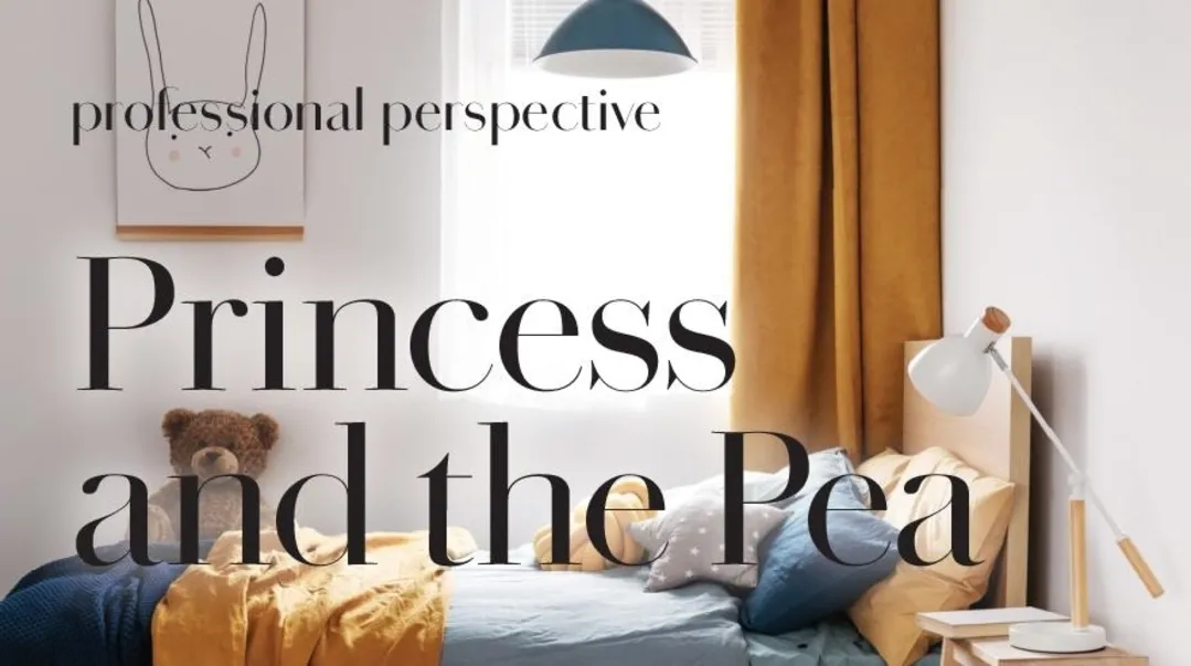
With the bed being the focal point in most bedrooms — the castle in make believe, the classroom when playing school, and the piece of furniture in our homes that screams, “You made it to bedtime!” — it deserves its own time to shine. Whether in accessorizing, purchasing quality linens, or pulling together a total look, there’s a lot more to a child’s bed than just a mattress!
Comfort First
My children all know that I am a huge believer in a comfortable bed, and they can attest to my focus on making sure that besides being aesthetically pleasing, their beds are also super cozy and comfortable.
“Cozy,” however, is an adjective that doesn’t include a manual. Here are some of the tips I’ve compiled to break down this multi-step process.
The first thing you need to do is select the right mattress, duvet, and pillows. While there’s been much hype over hypoallergenic and alternative duvets, I’m still a classic down-blanket-and-pillow type of girl. After that, I highly recommend buying a good-quality duvet and pillow insert. Not only is this crucial for the comfort of the bed, but it’s also important for getting bedding to lie flat. I can’t even tell you how many times I’ve seen lumpy duvets in the most beautiful and expensive linen sets, ruining the entire look.
Pillows and Patterns
Over the past few years, we’ve seen a complete shift in how bedrooms look. In the past, people bought an entire bedroom set with all the accoutrements matching.
Nowadays, they’re gravitating to a more collected and layered look, extending even to the bedding and linens. Mixing and matching pieces is not just very trendy, but it can also be extremely cost effective.
Some important general rules:
Make sure the pillow you get is the correct size for the bed. For twin beds I suggest a standard-size sham, at least two per bed plus any additional throw pillows. For full, queen, and king size beds, I recommend a kingsize pillow. Although this is a personal preference, I recommend longer pillows when possible. Besides the look, to me they’re more comfortable to sleep on.
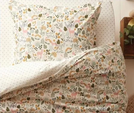
When mixing patterns, you never want to mix two patterns of the same scale . If one pattern has a smaller motif, printed close together, like a small floral, the other pattern should be more widely designed, like a large plaid or stripe. If you decide to be adventurous and mix the fi tted sheet and duvet, for example, try to pick two patterns that share similarities in theme. Themes that carry through can be in color, like a pink floral and a pink plaid, or in pattern — a small-scale blue pinstripe paired with a wide, blocked blue stripe. The key is staying consistent in ensuring that you’re placing a small pattern with a larger or wider one. Otherwise, the eye won’t know where to rest, and the look will feel cluttered and forced.
If you’re into the more monochromatic look, try mixing different textures of the same color to maintain visual interest. For example, for an all-white cotton or linen look, adding a velvet throw blanket or a chunky knit and some textured pillows creates a layered look while staying true to the neutral aesthetic.
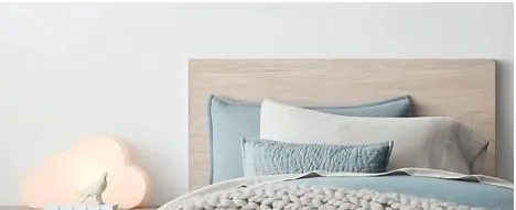
Don’t overdo the throw pillows and blankets. A foolproof method to styling a bed is two shams per bed and a long lumbar pillow. This makes the bed look done without too many extra accessories. I also like mixing shapes, like long, square, and round, instead of using all the same. Remember, it doesn’t have to be symmetrical to be visually pleasing. I then add a separate throw to the last third of the bed. Always make sure that the fringes face the floor.
Shop Right
Here are some of my favorite places to score some great finds on bedding and accessories.
> H&M Home and Zara: Both stores have great linen in washed cotton for the softer, not-starchy look. I’ve also found great throws and bathrobes here.
> Amara: This is a great place to buy bedding online. It’s mostly high end, but there’s definitely a range.
> Amazon and Wayfair: I’ve bought bedding from both of these sites here over the years. It’s definitely hit or miss, but if you look for a high thread count you can usually find some nice things, as well as bedding basics. (In a wide generalization, the higher the thread count, the softer the sheet, and the more likely it will wear well over time. Good sheets have thread counts that range anywhere from 200 to 800, although you’ll occasionally see numbers over 1,000.)
> Marshalls, TJ Maxx, and Home Goods: These stores provide some serious retail therapy for me — I’ve found designer linen on numerous occasions that I was able to use in all different and creative ways. One of the companies I love is Piu Belle. They have the softest bedding imaginable, that casual look that’s not supposed to be too ironed and gets softer after each wash. How can you say no to that?
Whichever way you style your children’s bed — multilayered and intentionally haphazard, asymmetrical and patterned, or perhaps not styled at all, remember that comfort will always trump all trends.
Use different scales for successful pattern mixing
CYRILLUS.COM
For twin beds, one or two standard size shams work best, plus any additional throw pillows
RHBABYANDCHILD.COM
SATURATED SCENARIOS - Mishpacha Magazine

When it comes to home updates, I often find that people think in extremes: do nothing, or go for a total gut renovation. But really, there are so many smaller changes that can be made to give your home a simple rejuvenation! With color being the multifaceted workhorse that it is, here are some scenarios where the subject requiring renewal is color focused:
Scenario 1
I’ve been dreaming of a hunter green kitchen. Is there a way to make this more timeless?
Hunter green is one of my favorite colors because it’s versatile and warming. Try adding in classic elements to tone down its trendiness, while enhancing its softness and diversity.
Put in a black and white (or gray and white) checkerboard floor. This is a classic pattern that will make the green pop.
Consider adding some brass hardware and a Carrera marble-look counter (porcelain is stain proof and has a similar feel), plus wood tone accents or seating to soften the room.
Scenario 2
My kitchen is brown wood and not in great condition, but I don’t have the budget to start from scratch. I really want a fresh taupe kitchen. What updates can be done?
Here are a few ideas that aren’t too pricey:
Replace some or all of your cabinets with Ikea frame, which are simple and inexpensive and add custom fronts.
Update some of the kitchen cabinets, designing it so your kitchen has two different color cabinets.
Try replacing the finish and style of your hardware and faucets. This alone can make a huge difference.
If a transformative paint job is not in the works for you anytime soon, fret not. Creating a room that is special for you and your family is all in the details, those indefinable small elements that make your home uniquely yours. Don’t rush into a decision that doesn’t feel right for you taste, family, or lifestyle, regardless of how on trend a color is – because when it’s all said and done, it’s your house and it should feel like home.
Scenario 3
The walls of my house are light yellow and not my taste, but we aren’t repainting all of it now. What can I do to make it feel more like me? I like cooler tones.
You’d be surprised at how well yellow pairs with cooler colors to achieve balance.
Try pairing the yellow with a dark bluish-gray on a door or accent wall.(Check out Benjamin Moore’s Hale Navy, in “The Primaries of Color,” as an example.)
Add in layers of grays and navies, in, in tea towels, table-cloths, and art, to give the space a more updated look.
Add a pattern to break up the color blocking, using the colors you’ve incorporated.
Scenario 4
We live in an older home, and the boys’ bathroom is pink. I’ve told them pink is the new neutral, but to no one’s surprise, they’re unconvinced. What can I do to make it feel more boyish?
Although pink is arguably a more feminine color by nature, there are definitely ways to balance it out.
Buy removable wallpaper and completely transform a basic pink bathroom for a fraction of the price of regular wallpaper. Consider black and white or a neutral stripe.
Finish off the look with some old black and white photos of vintage sports.
Use dark and contrasting accents to create a more masculine feel.